Service

Rebranding

Diagnosis, repositioning and a new identity so the brand tells who the company is today, without losing what it has already earned.

  • Diagnosis
  • Repositioning
  • Naming
  • New identity
  • Rollout

BRAND REPOSITIONING

Your company has evolved. Your brand needs to tell that story

A well-executed rebranding starts with diagnosis: what to keep, what to change and why. From there, we review strategy, name, identity and communication, and plan the rollout so customers and staff understand the new chapter.

We renew brands that have grown, changed or fallen behind, without losing what the audience already values.

The service

What rebranding is and how BDDB.ag works

Rebranding is the strategic review of an existing brand: positioning, name, visual identity and communication are reassessed to reflect where the business stands today. BDDB.ag leads rebranding projects from diagnosis to launch, deciding with the client what changes and what should be preserved. It can be a relift (an update) or a brand-new brand.

When to rebrand

The most common signs we see in our projects:

  • The company has changed (grown, expanded its services, entered another market) and the brand fell behind.
  • The audience sees the brand as dated, small or generic compared to what the company delivers.
  • Mergers, acquisitions or new units created brands that don't speak to each other.
  • The name limits expansion or causes confusion with competitors.
  • Every piece of material looks different and the brand has lost consistency.

If you're still wondering whether it's worth it, first read Rebranding: what it is, how and when to do it and Brand repositioning: how to know the right time.

Relift, repositioning or a new brand?

Not every rebranding has to change everything. In a relift, the brand is modernized while keeping the elements the audience already recognizes. In a repositioning, the strategy changes: who the brand speaks to and what it promises. In some cases, the diagnosis shows that a new name and identity are needed. The decision comes from research, not personal taste.

What we deliver

  • Audit of the current brand: applications, audience perception and competition.
  • Interviews with leadership, staff and customers.
  • New brand platform and positioning.
  • Naming, when needed.
  • Relift or new visual and verbal identity.
  • Updated brandbook.
  • Transition plan: what to change first and how to communicate the change to staff, customers and suppliers.
  • Launch campaign and event, internal and external.

How it works

  1. 01Diagnosis

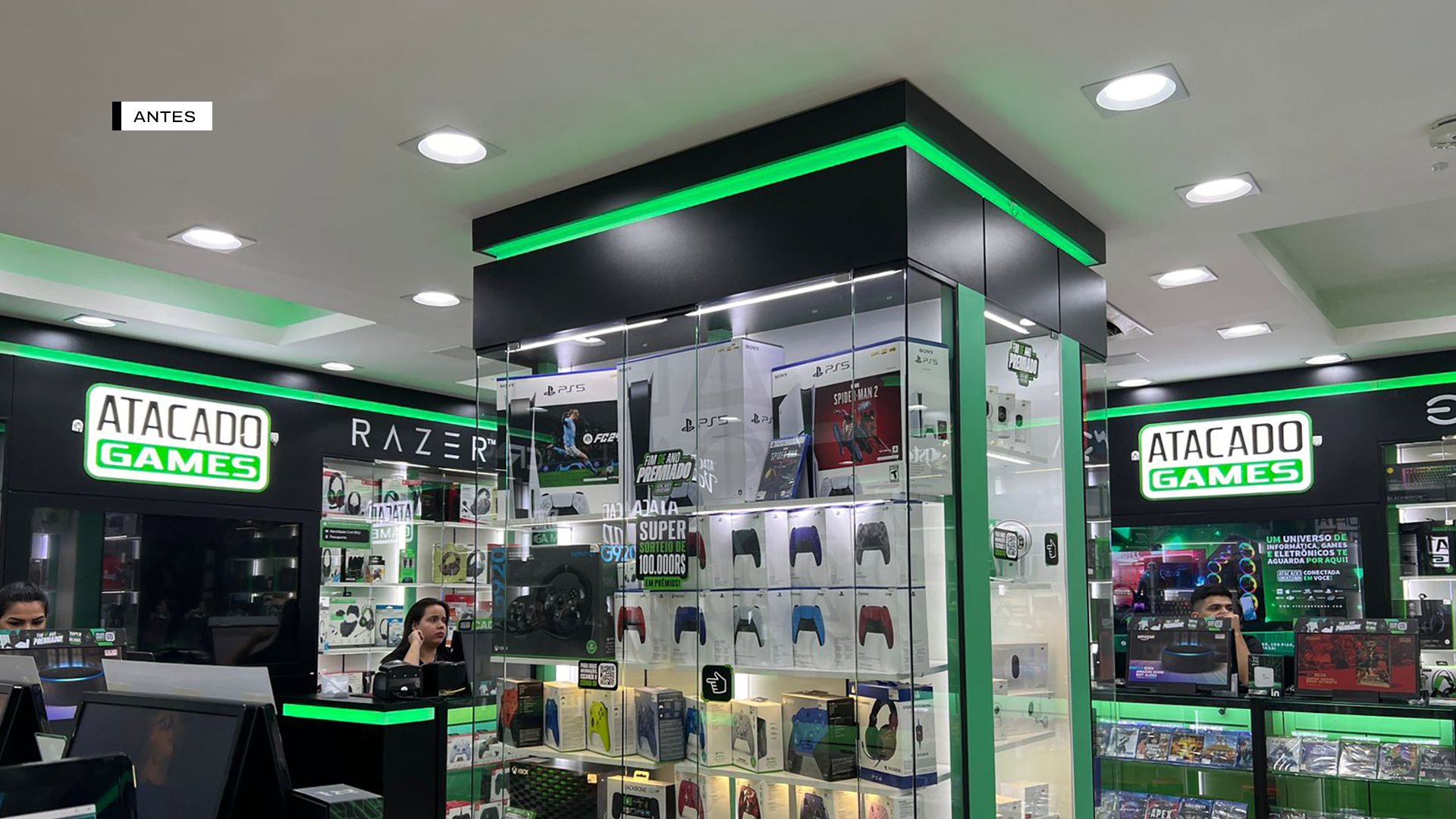
    We map everything the brand has already built. At Atacado Games, in Paraguay, the qualitative and quantitative research and the interviews with leadership showed that a name change was necessary for the new positioning.

  2. 02Strategy

    We define the new positioning and the degree of change: relift, repositioning or a new brand.

  3. 03Creation

    We develop the brand's new expression and test it on the most visible applications.

  4. 04Launch and transition

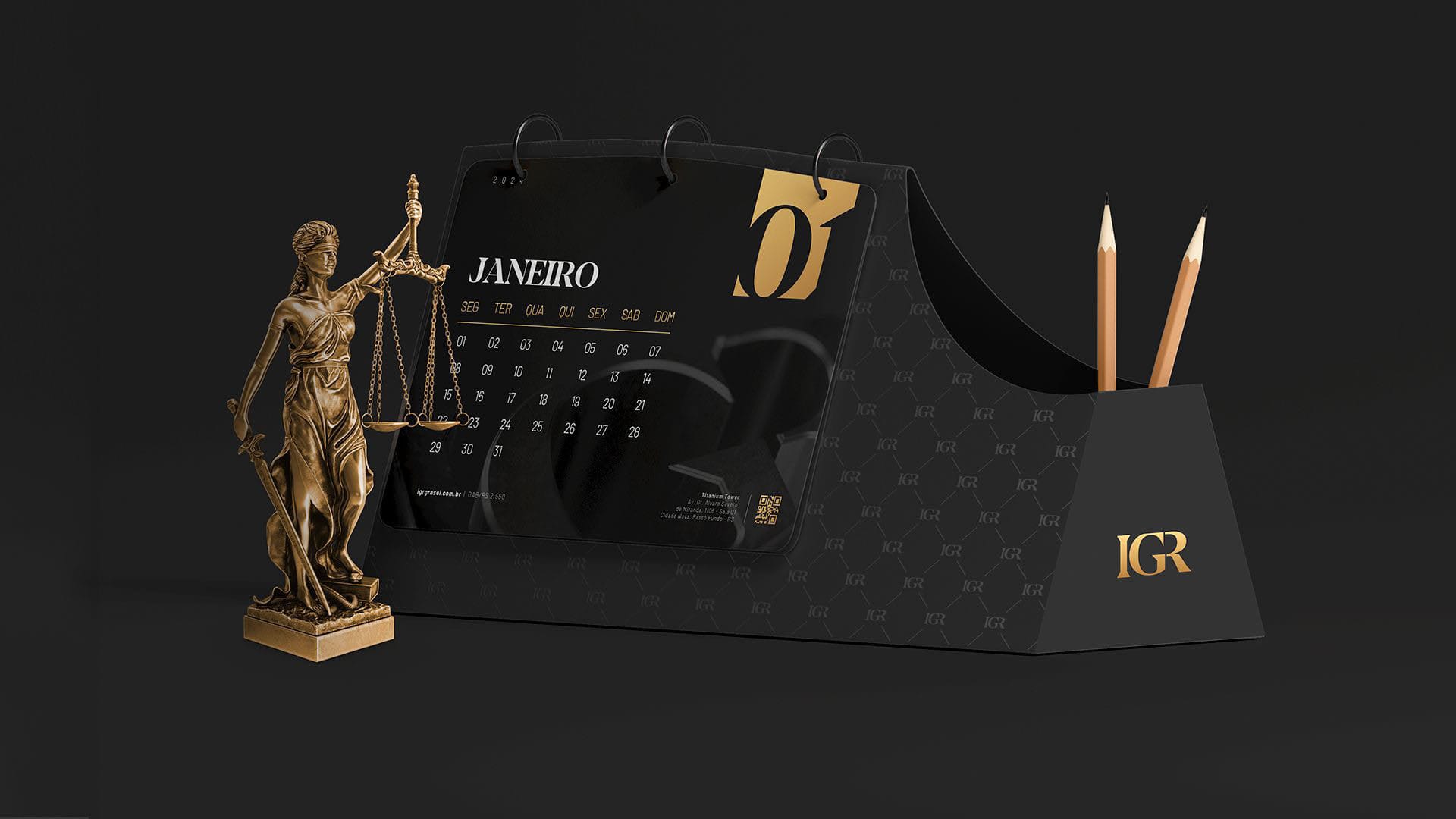
    We plan the switch so the market isn't confused. At IGR Grasel Advogados, the new positioning was presented to the team at an immersion event before reaching the external audience.

BRAND RELIFT · MOVMIX RENTAL

Ten years later, the brand needed to evolve without losing who it is

MOVMIX, a machinery and aerial work platform rental company, had a brand created about ten years earlier and already recognized on job sites, machines and among clients. Replacing everything would mean throwing that equity away.

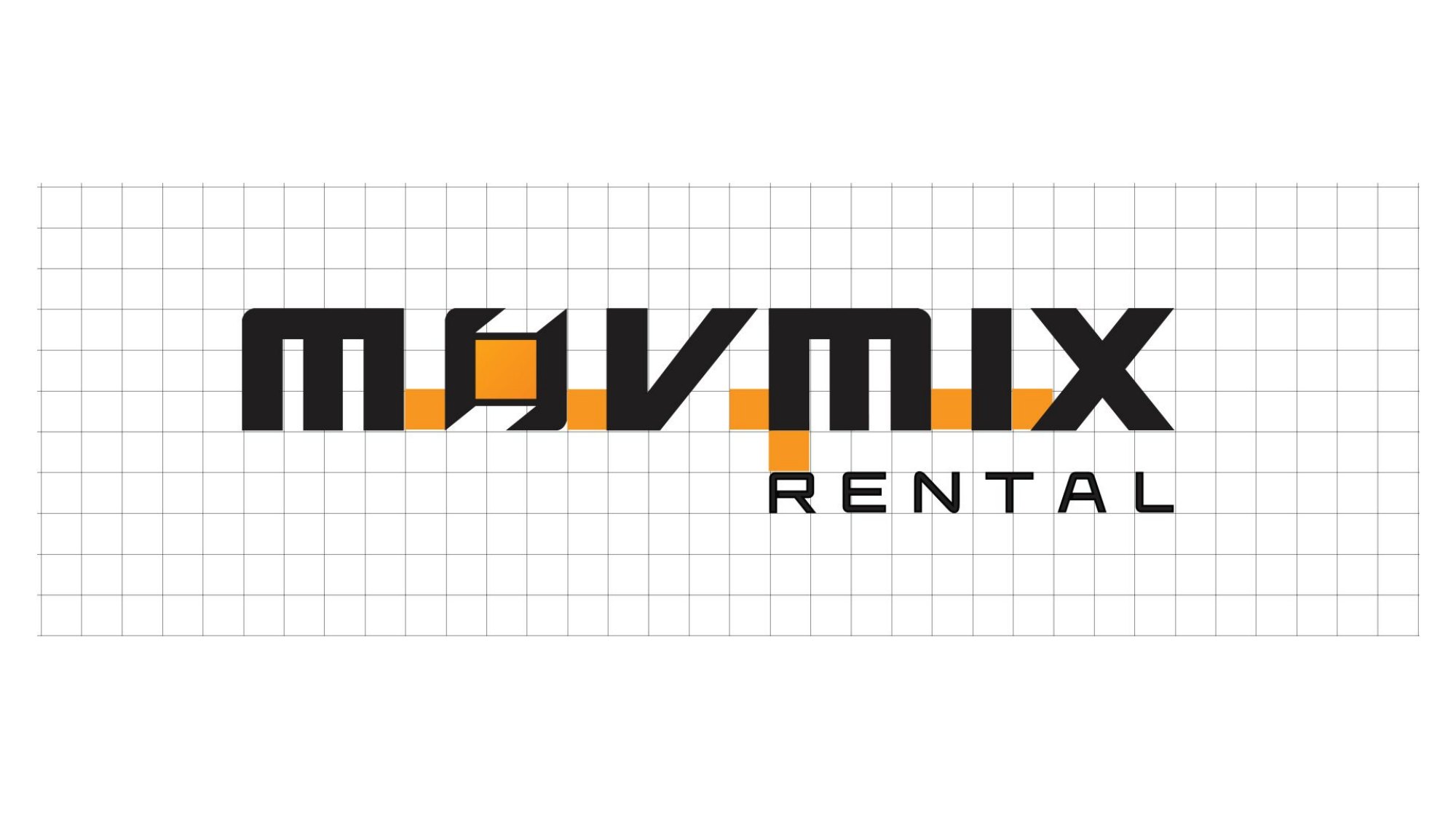
That's why the work was a relift: we redrew the brand on a grid, corrected the optical imperfections, standardized the symbol, swapped yellow for orange, lightened the RENTAL tagline and created a pattern, the phrase "Qualidade em movimento" (quality in motion) and the Car and Audio verticals. The visual essence stayed. What changed was the precision.

MOVMIX Rental brand applied to a machine
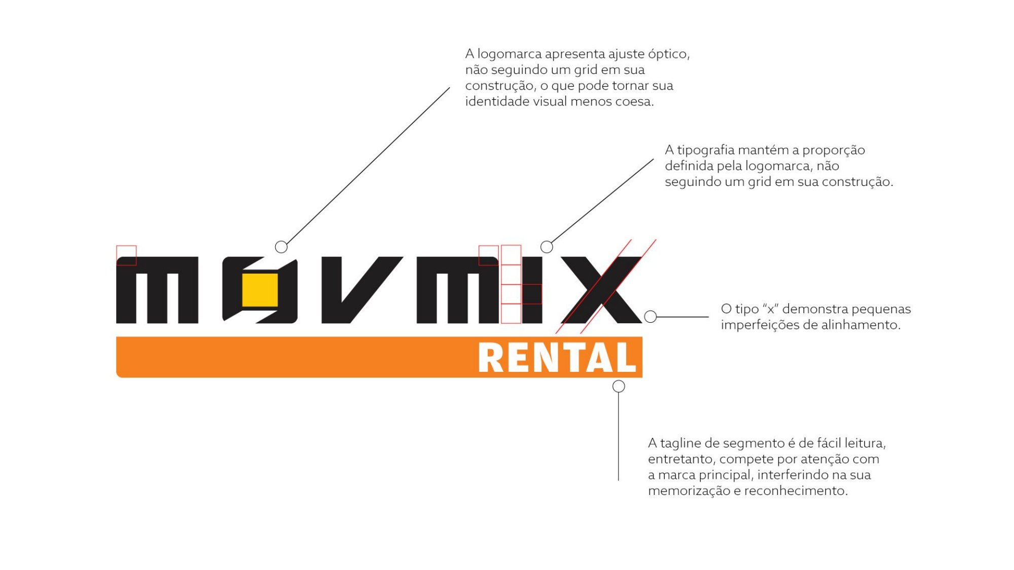
Diagnosis of the old MOVMIX brand

01Before

The diagnosis of the old brand

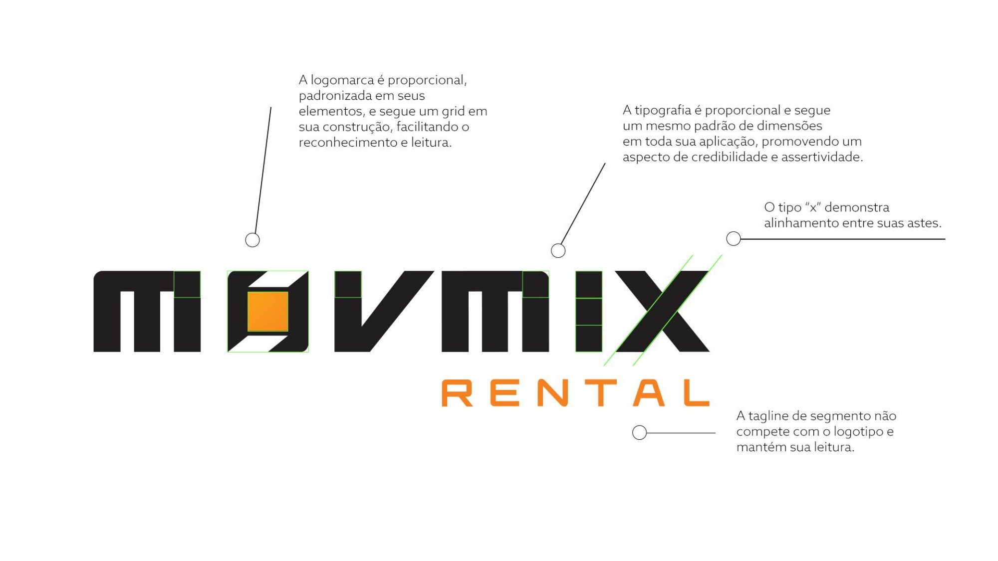
The logo relied on optical adjustment without a grid, the typography did not follow a proportion, the "X" had small alignment flaws and the RENTAL band competed with the name. Small deviations that, added together, made the identity less cohesive.
MOVMIX brand after the relift

02After

The same brand, now built with a ruler

A proportional, standardized logo, typography with a single set of dimensions, aligned "X" strokes and the tagline in the background. Clients recognize the MOVMIX they have always known, only firmer and more legible.
MOVMIX symbol before and after

03Symbol

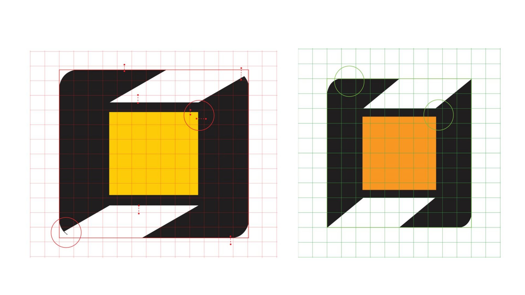
The symbol, refined down to the detail

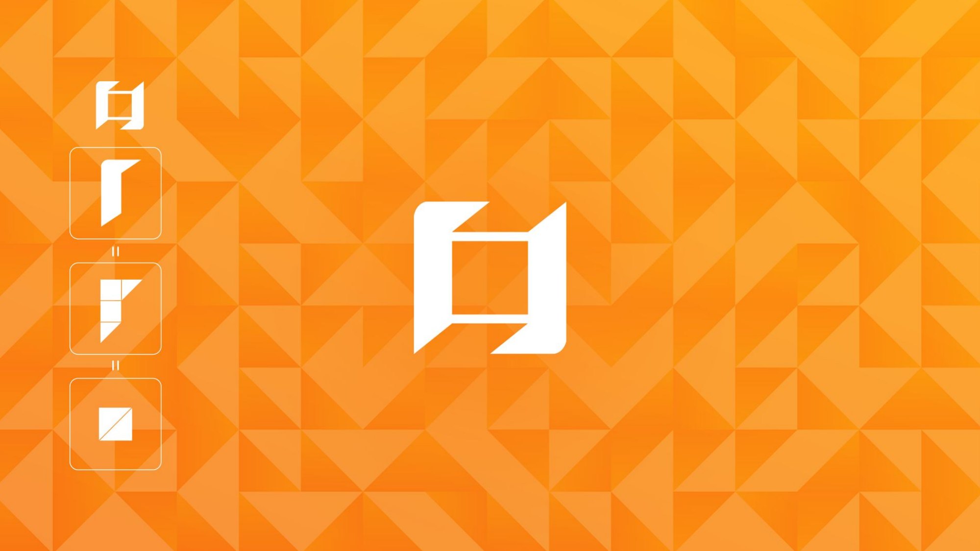
Corners, angles and stroke weights redrawn on a grid, and the central square changed from yellow to the brand's orange. This is the symbol that became the pattern and the signature on the machines.

From the redesign to the machines

MOVMIX brand on a grid
Brand on a grid
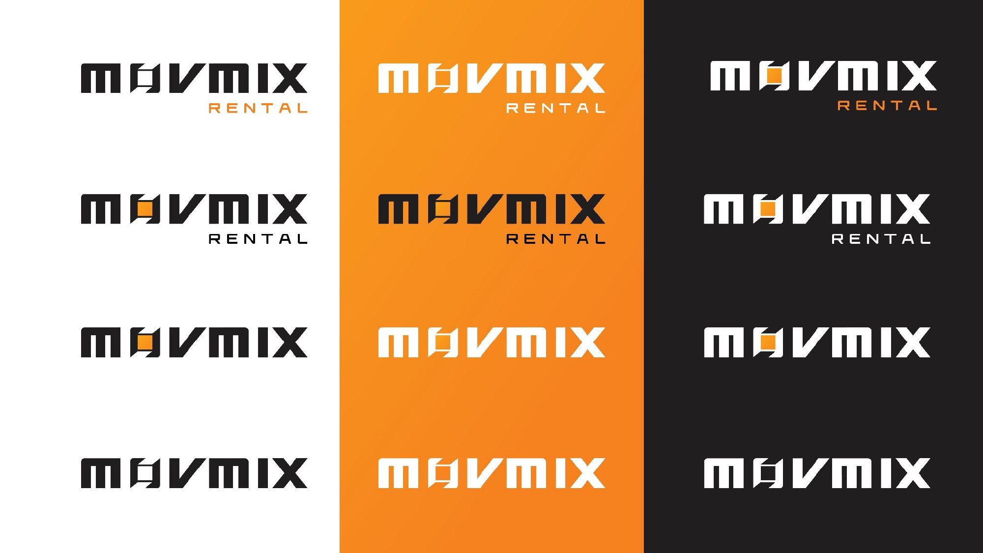
MOVMIX brand versions
Brand versions
MOVMIX color versions
Color versions
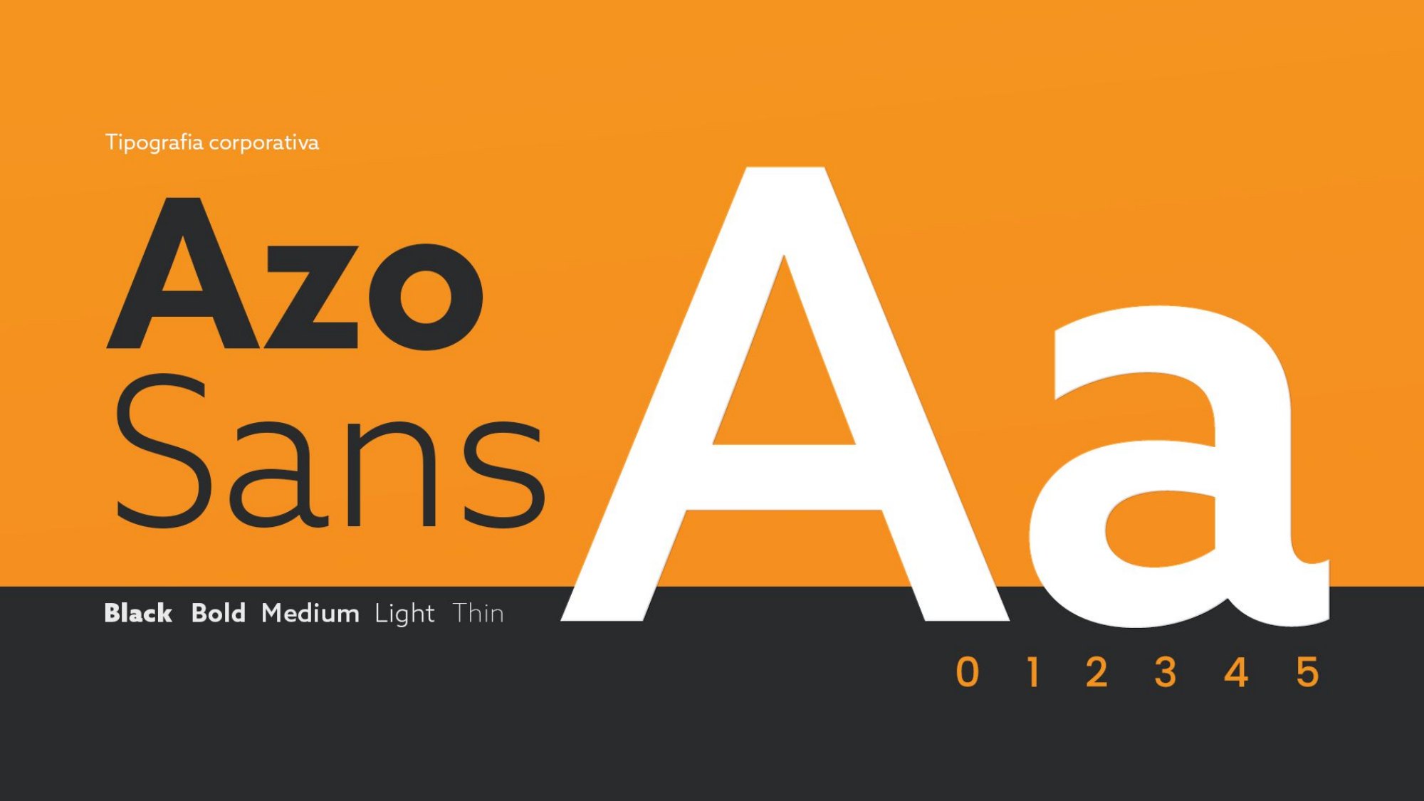
Azo Sans typography
Azo Sans typography
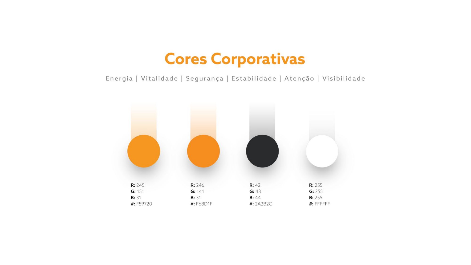
MOVMIX colors
Corporate colors
MOVMIX pattern
Pattern derived from the symbol
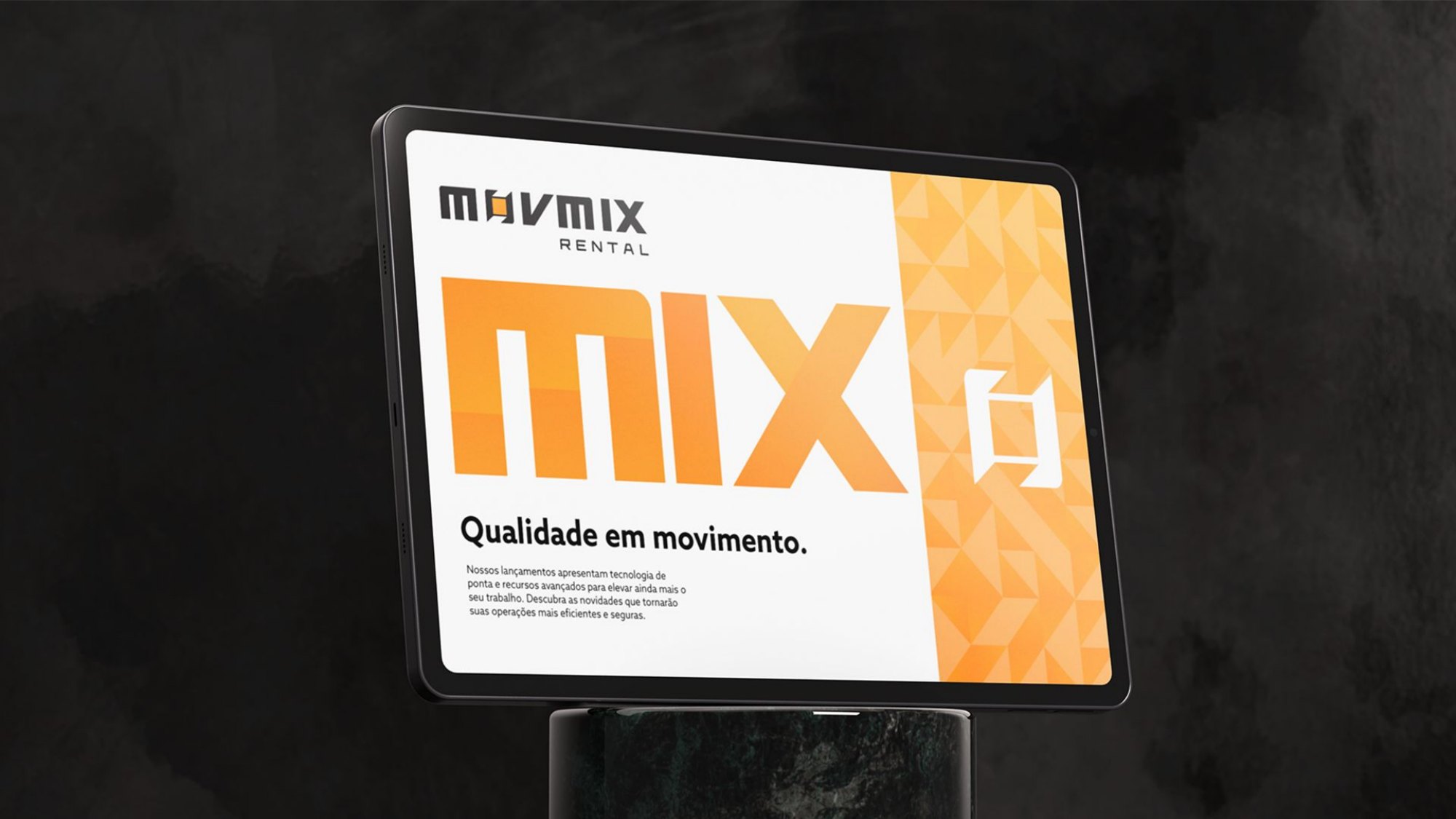
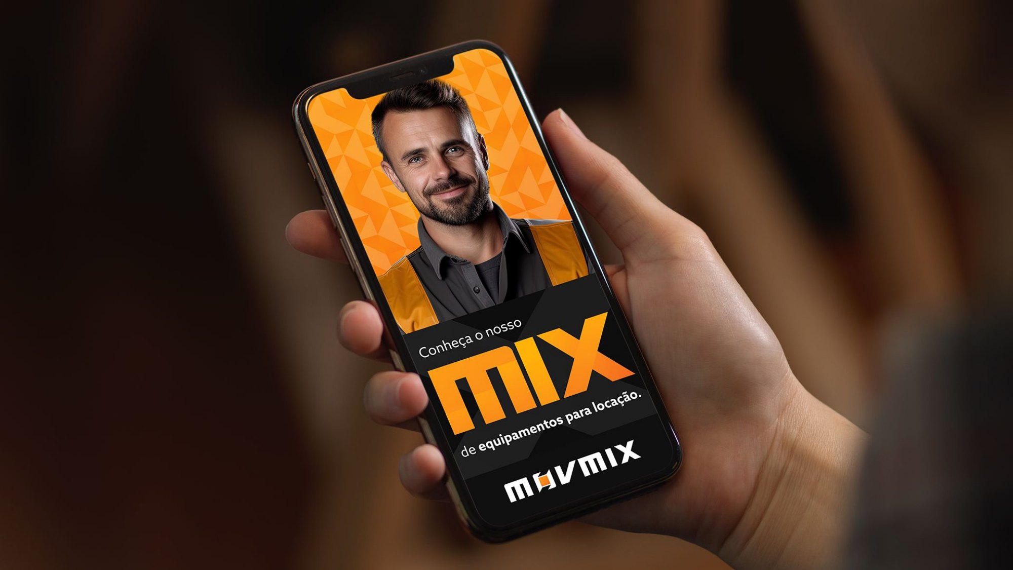
MOVMIX digital application
"Qualidade em movimento"
MOVMIX stationery
Stationery
MOVMIX facade
Facade
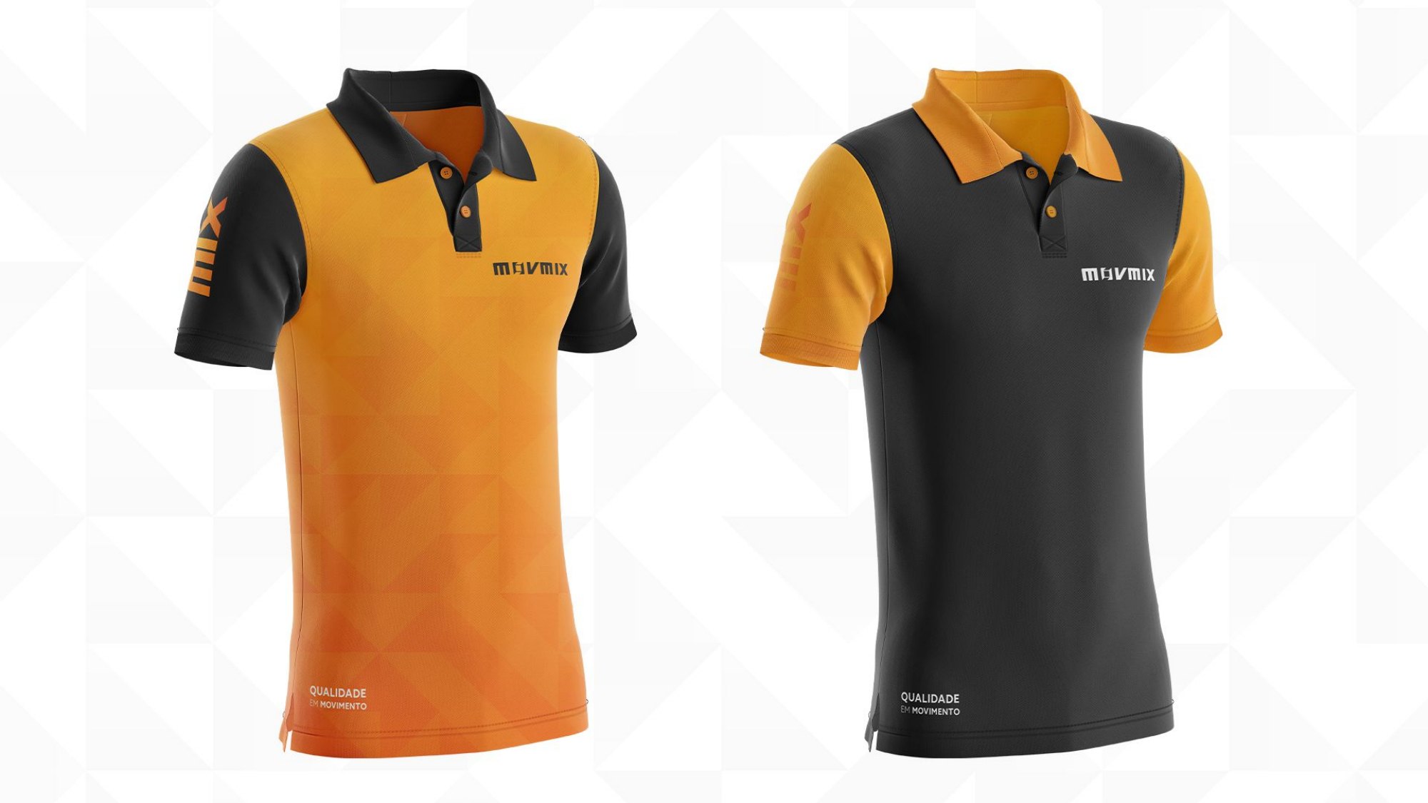
MOVMIX uniforms
Uniforms
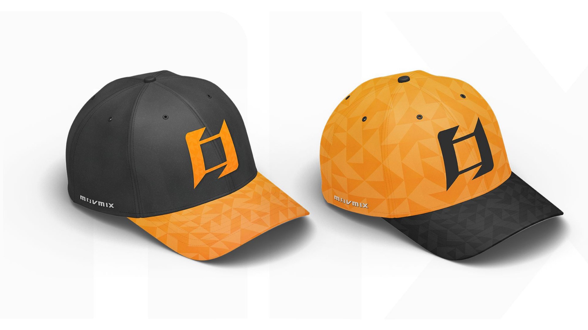
MOVMIX caps
Caps
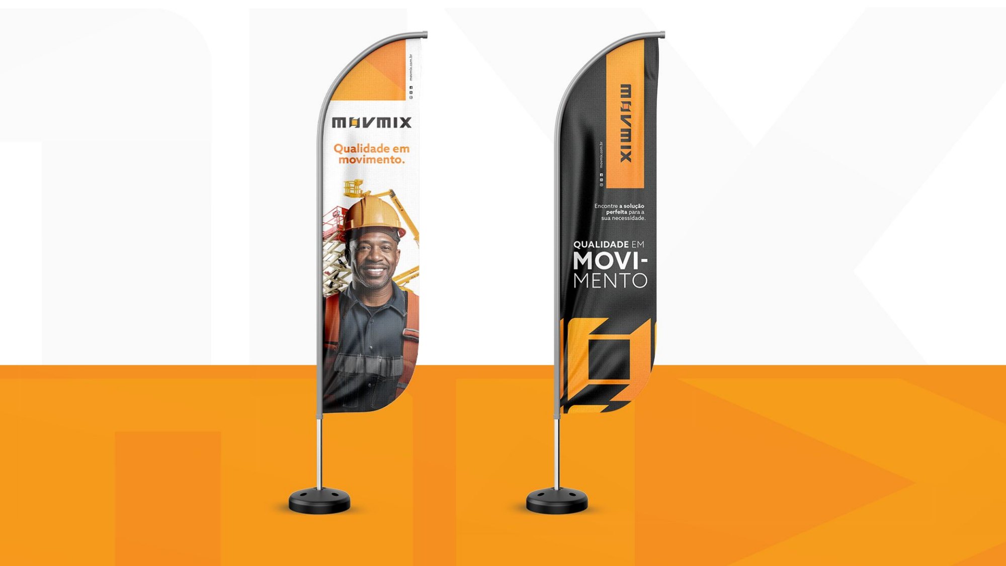
MOVMIX wind banners
Wind banners
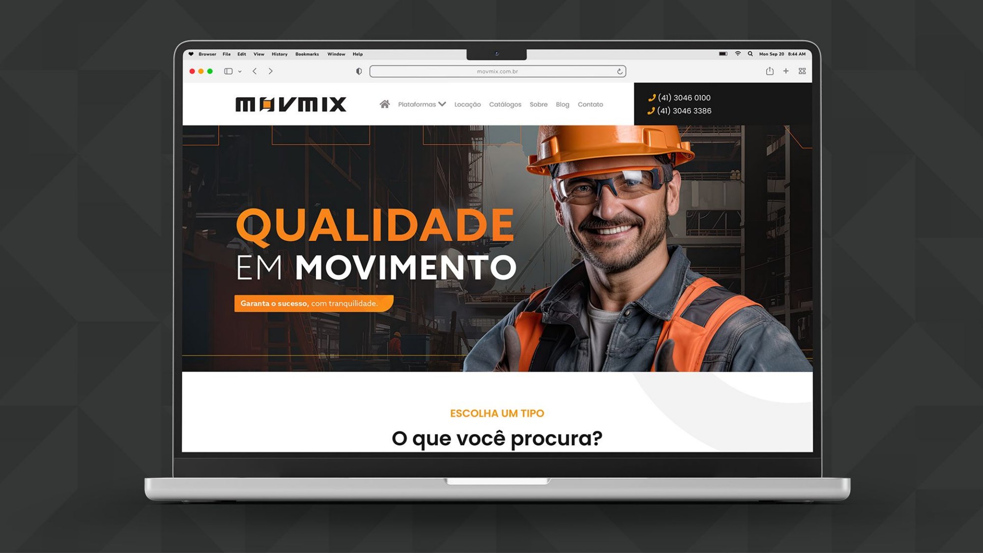
MOVMIX website
Website
MOVMIX billboard
Billboard
MOVMIX mobile
Mobile
MOVMIX verticals
Car, Rental and Audio verticals
MOVMIX Áudio billboard
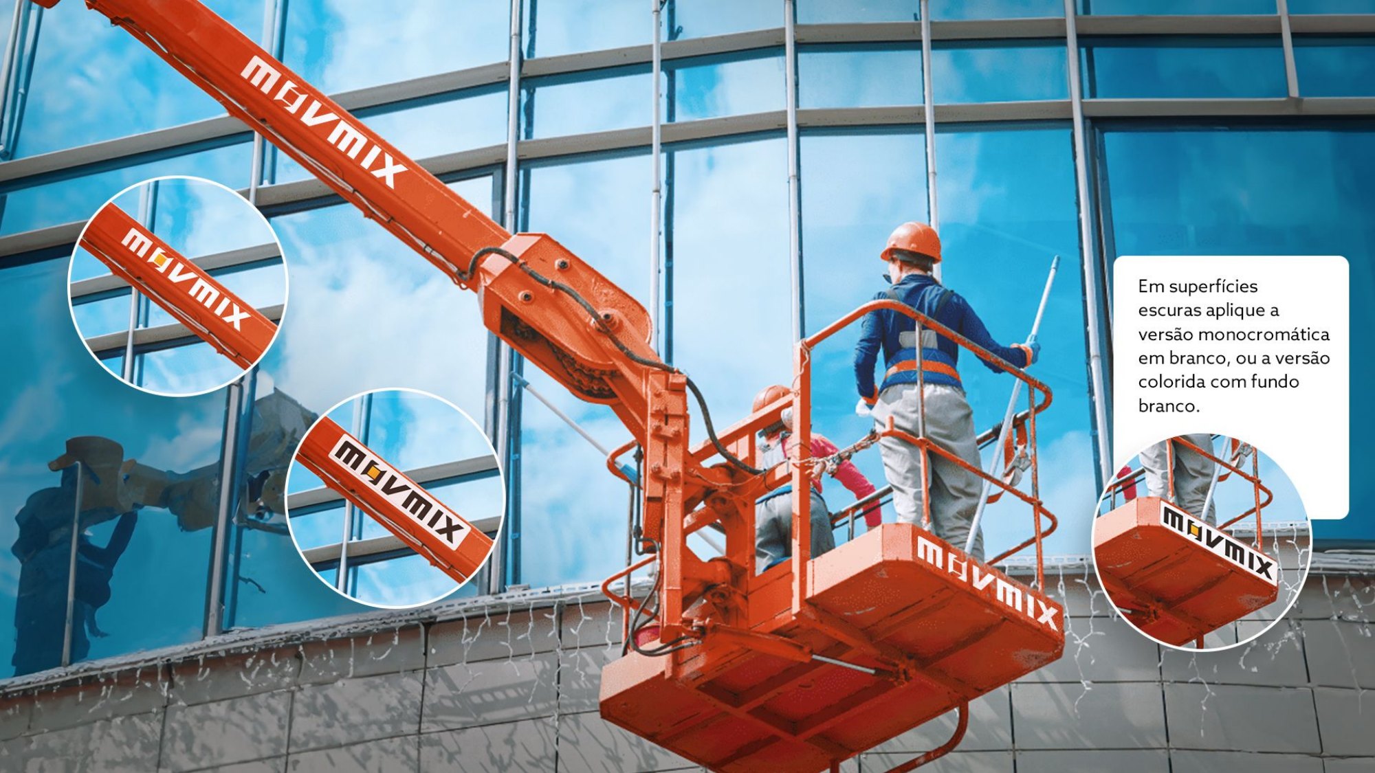
MOVMIX machine
Scissor lift
MOVMIX articulating machine
Articulating boom lift
MOVMIX machine on a job site
In operation on the job site

REBRANDING · MAGAZORD

From MAGAZORD to Magazord: the MegaZord that brings every solution together

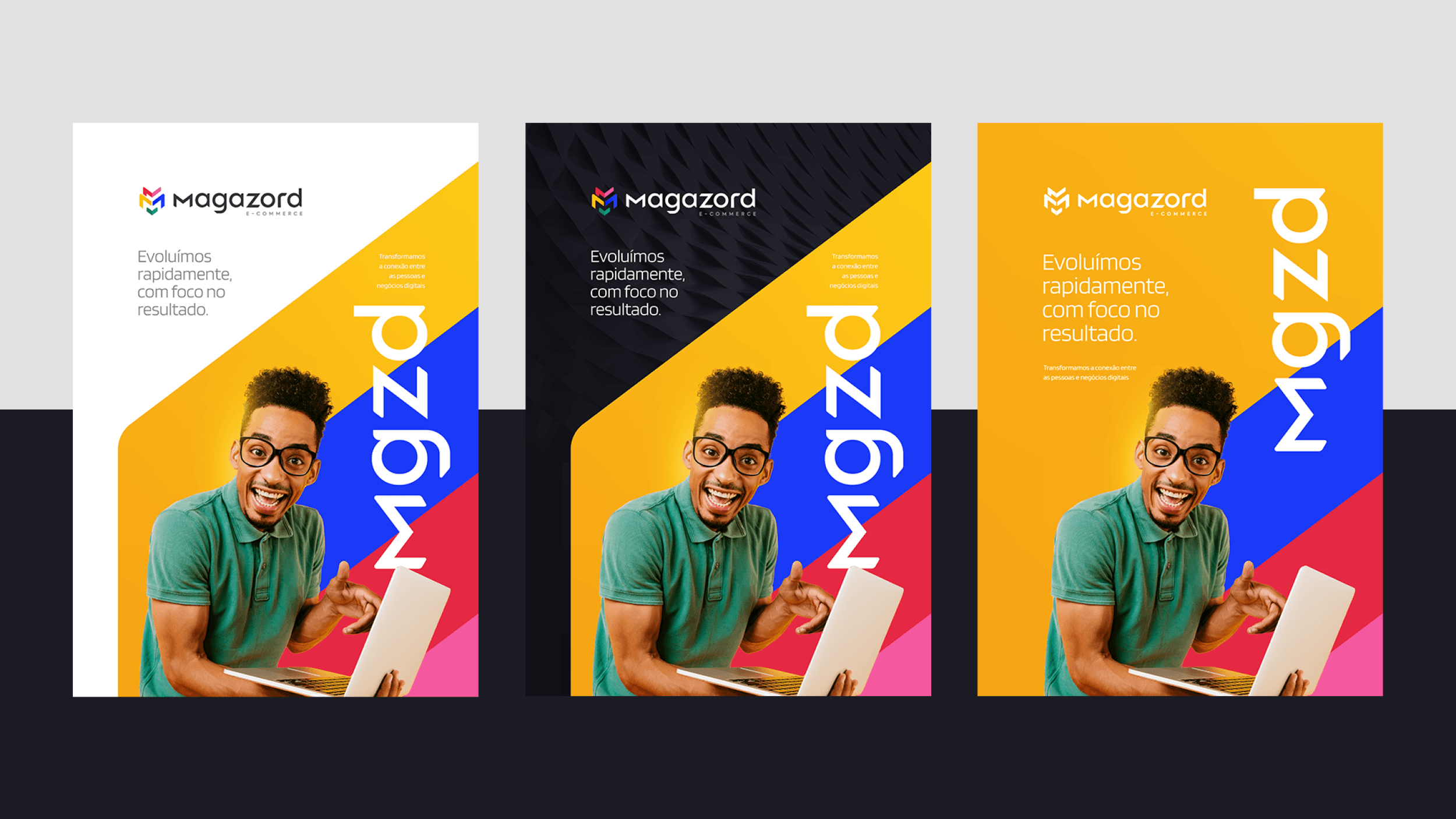
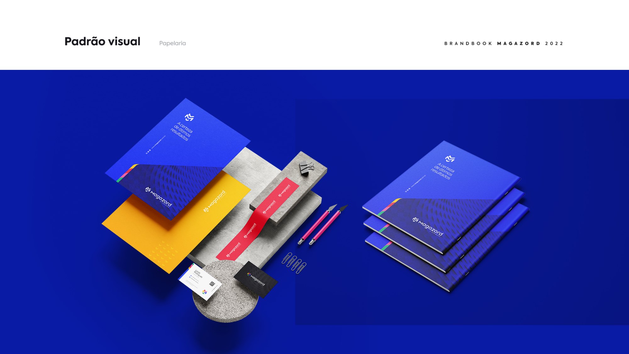
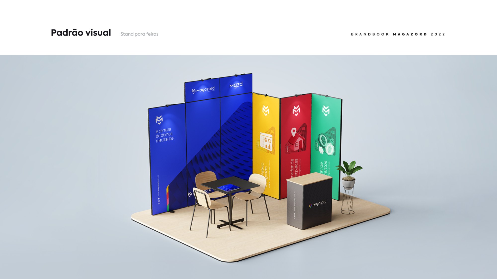
Magazord started as an e-commerce platform and grew into an ecosystem: platform, marketplace hub, integrator, payment gateway, shipping gateway and corporate solutions. The old brand, red and in all caps, spoke for a single product.

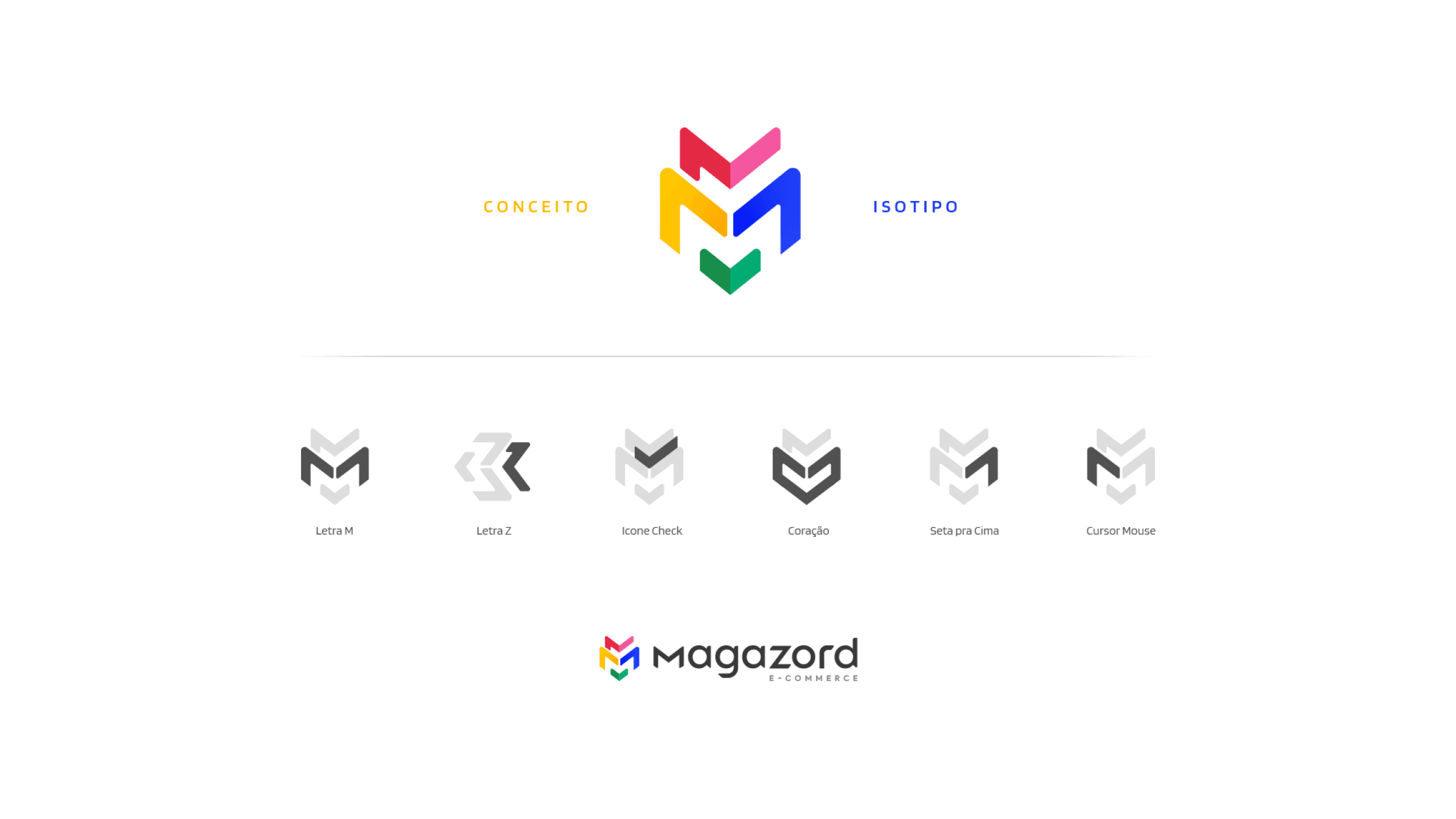
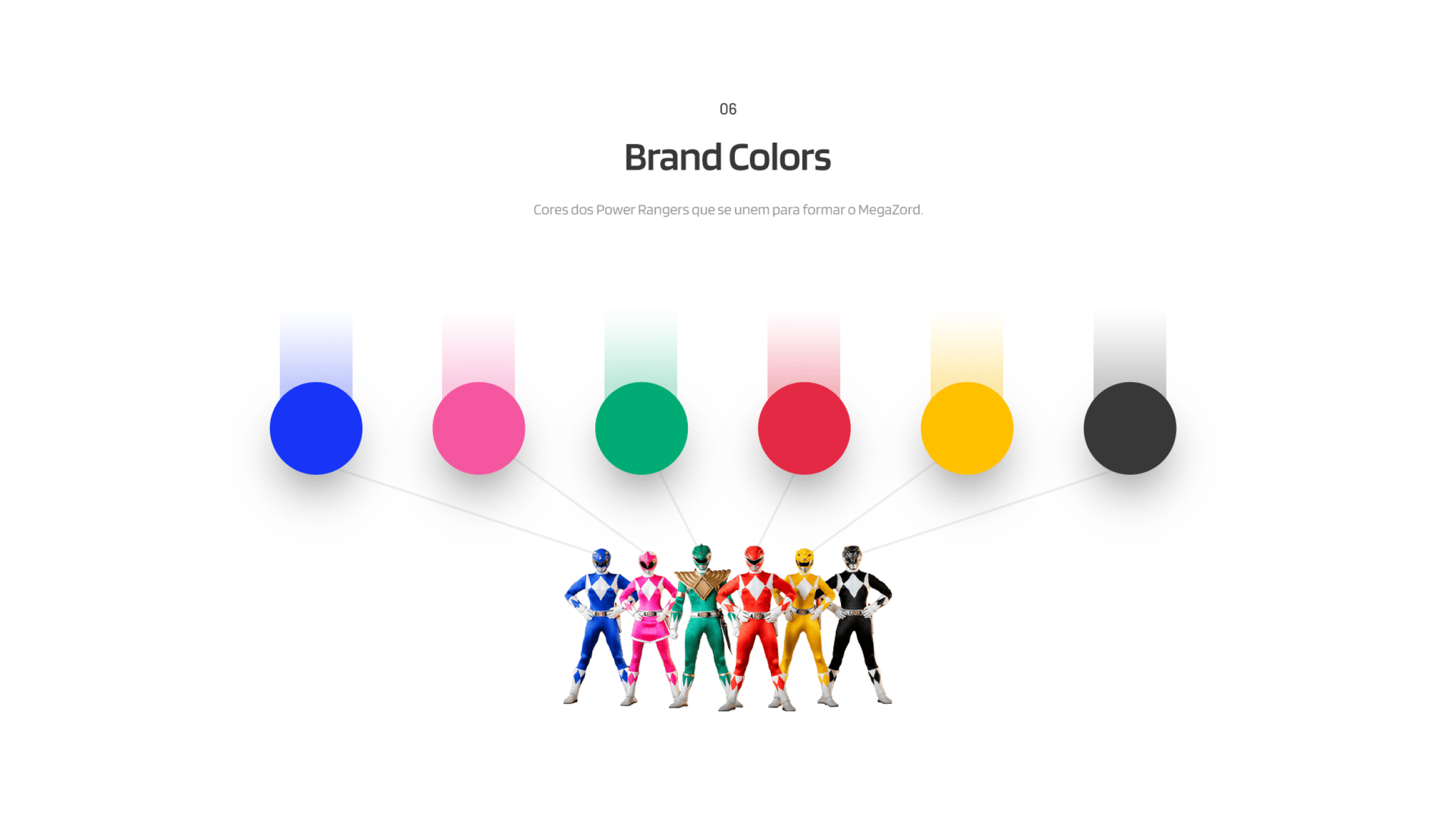
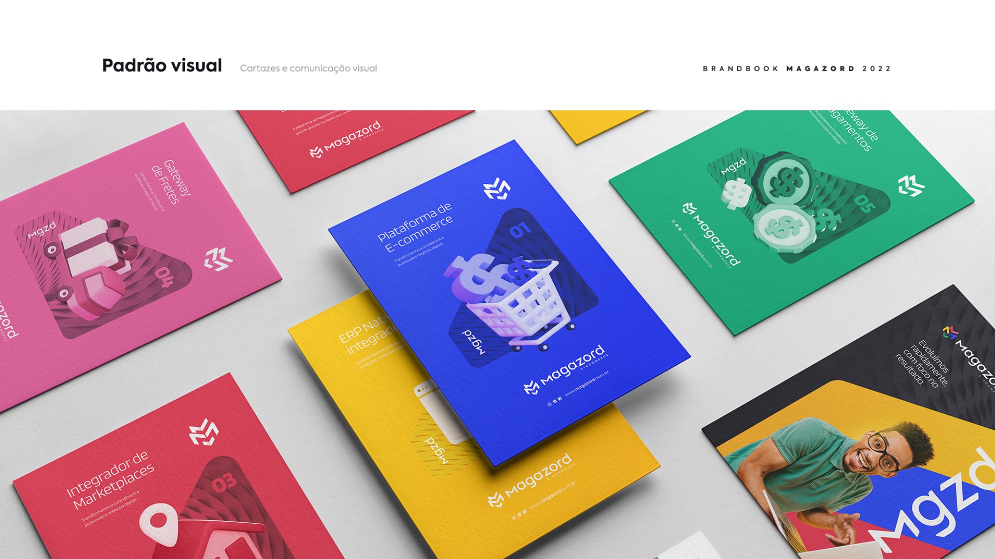
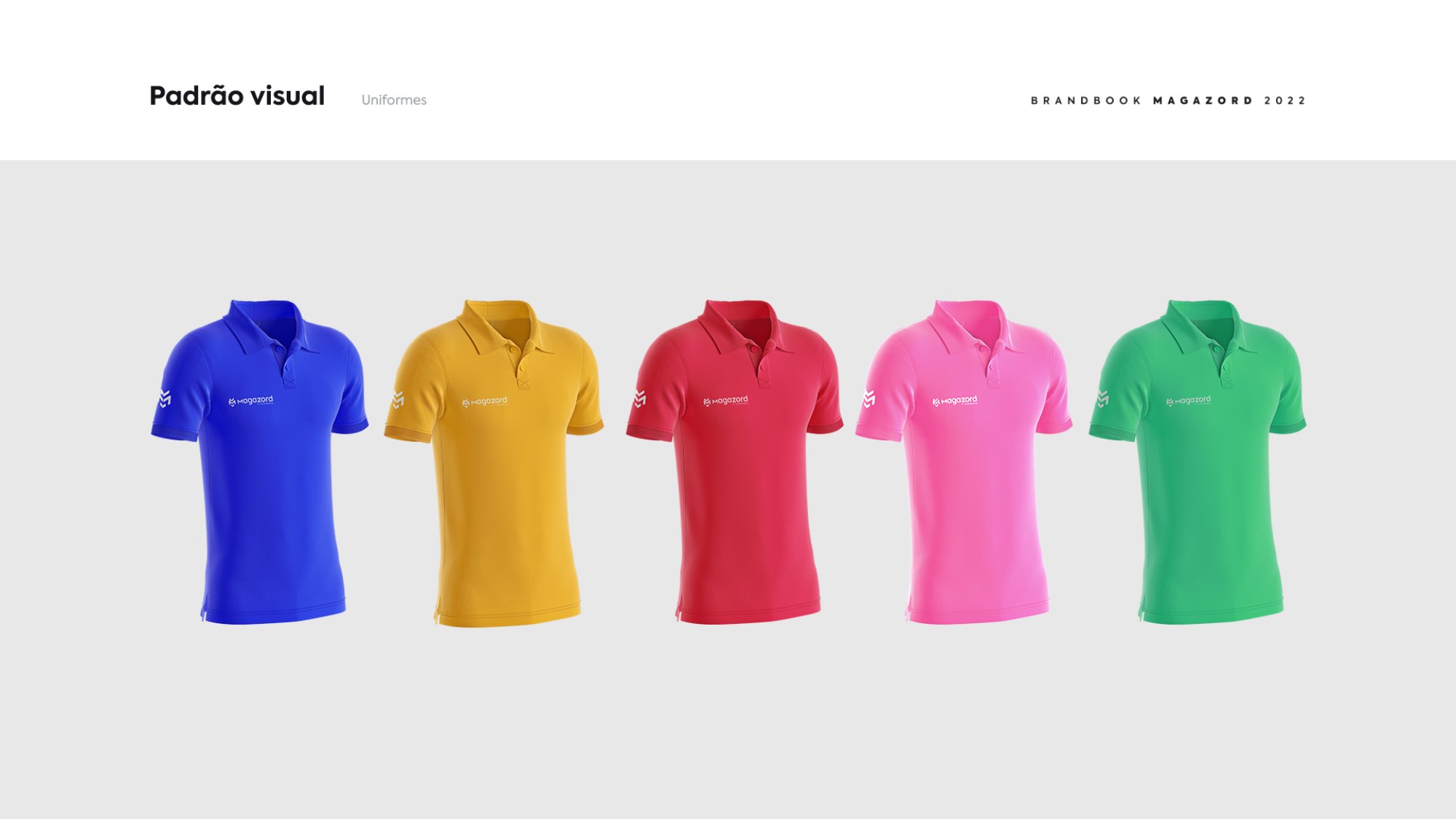
The concept came from the name itself: the colors of the Power Rangers who join together to form the MegaZord. Each color became a solution line, and the new isotype combines the letter M, the letter Z, the check mark, the heart, the up arrow and the mouse cursor in a single symbol.

Old MAGAZORD brand, e-commerce platform
Before: MAGAZORD, e-commerce platform
New Magazord brand in positive and negative
After: Magazord, digital commerce

Concept, brandbook and applications

Magazord isotype concept
Isotype concept
Magazord brand colors
Colors that come together, like the MegaZord
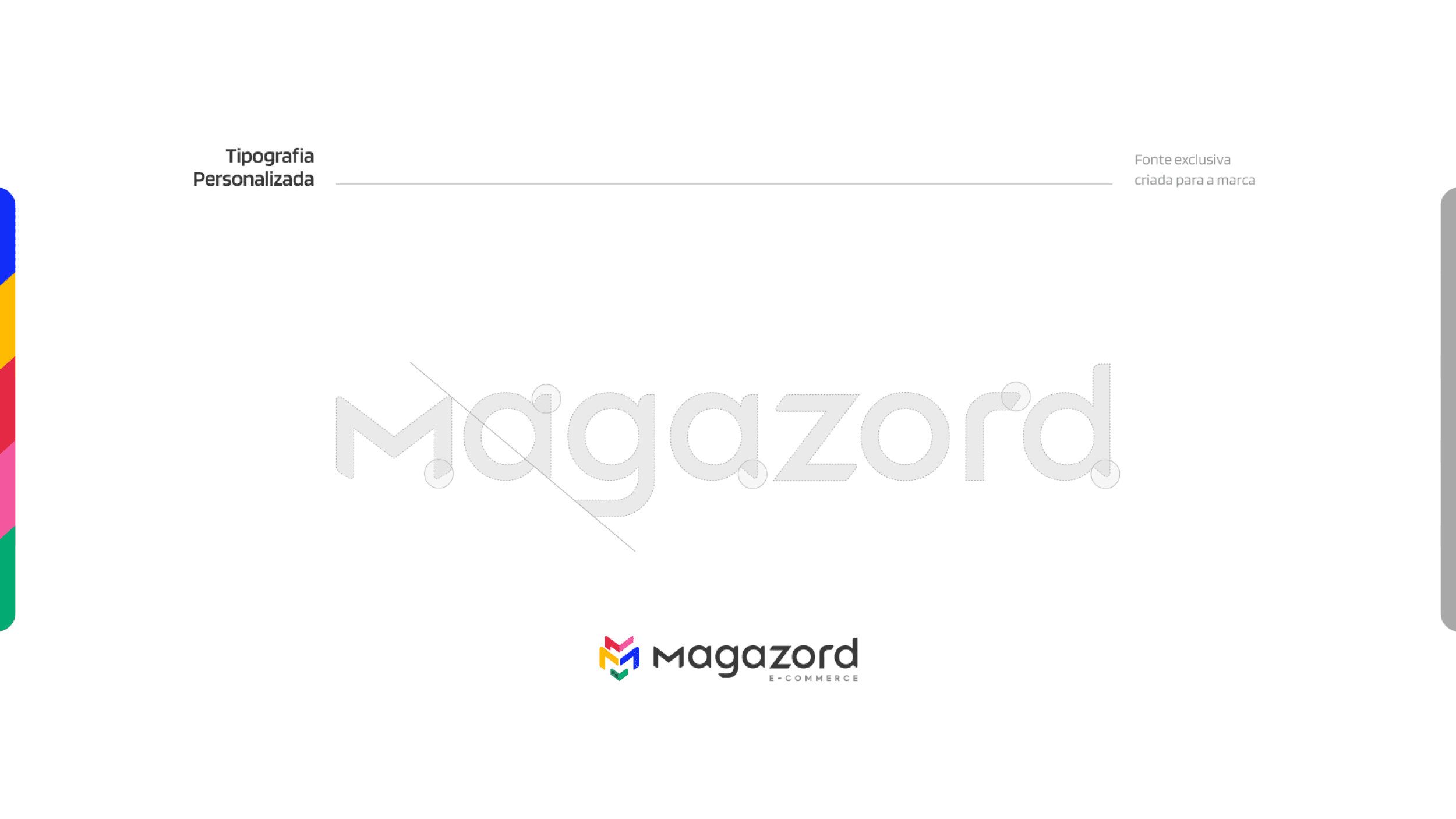
Magazord custom typography
Custom typography
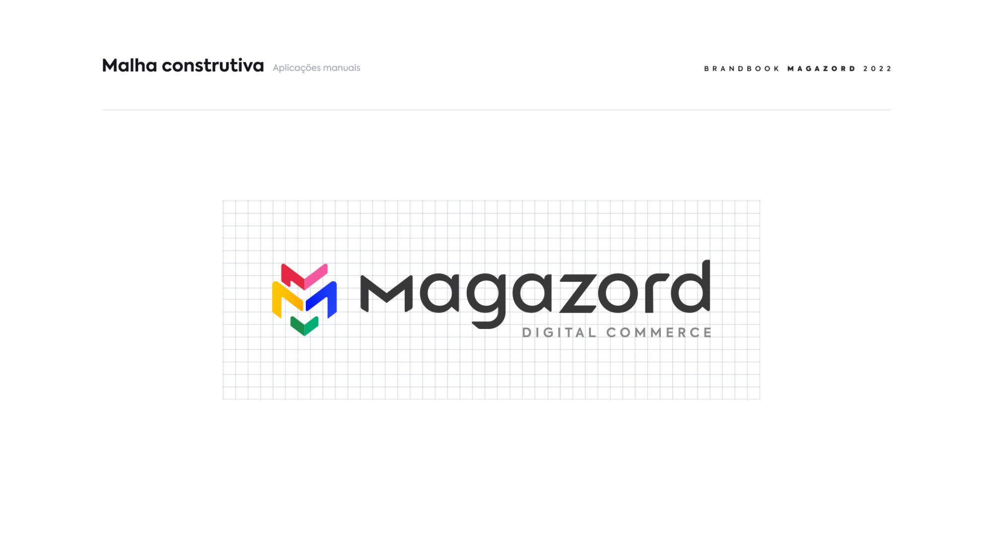
Magazord construction grid
Construction grid
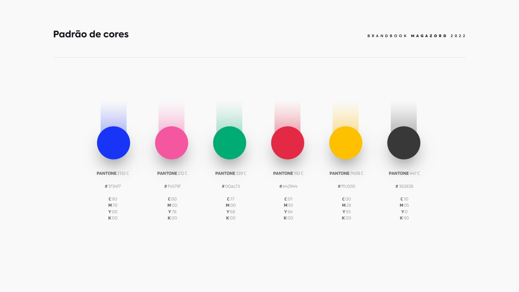
Magazord colors
Color standards
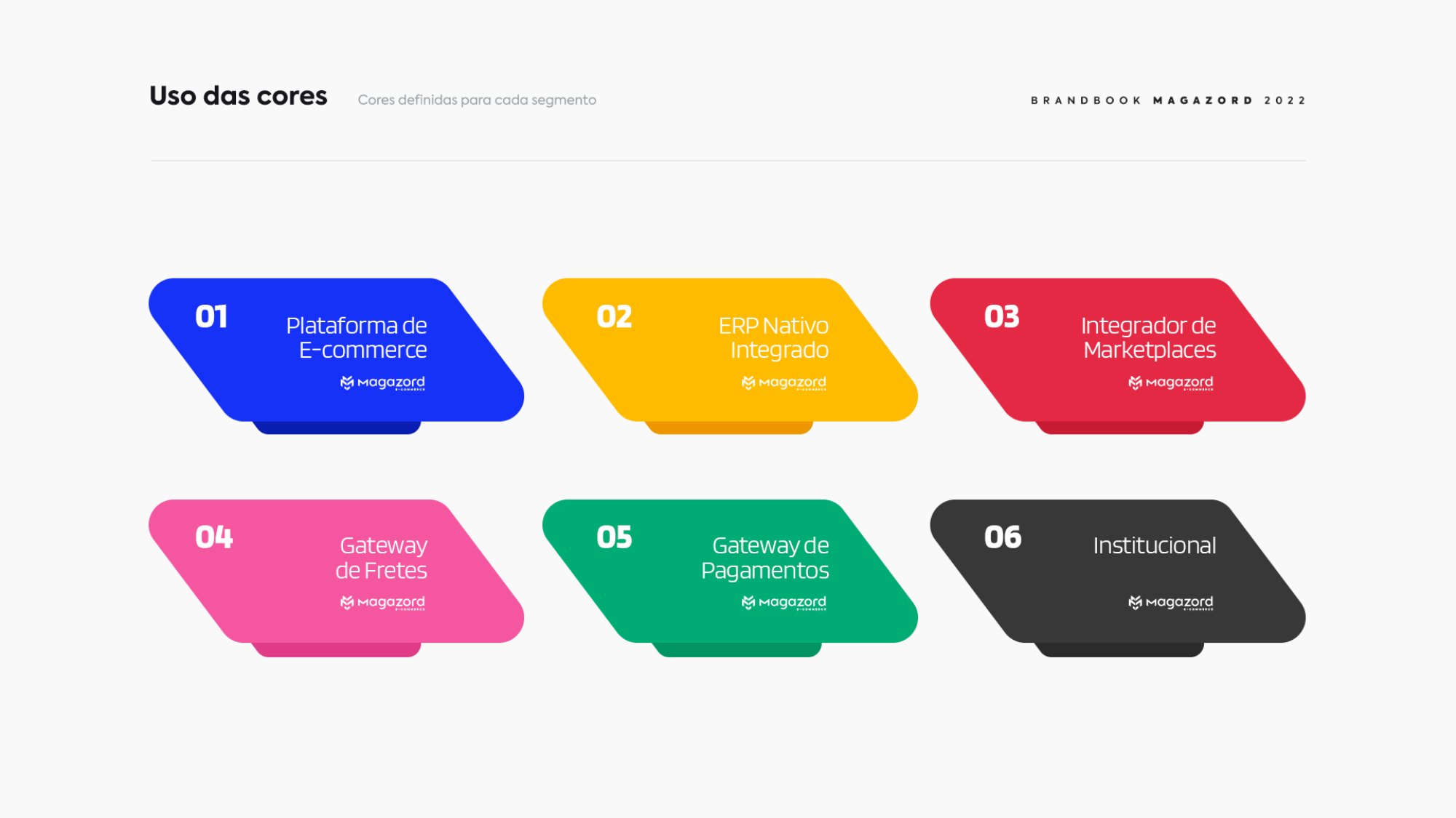
Magazord color usage
One color for each solution
Magazord icons
Icons
Magazord elements
Graphic elements
Magazord pieces
Pieces in the new language
Magazord communication pieces
Communication
Magazord product lines
Product lines
Magazord stationery
Stationery
Magazord trade show booth
Trade show booth
Magazord giveaways
Giveaways
Magazord uniforms
Uniforms

BRAND REDESIGN · TAF

The founder's symbol stays. The brand's voice changes

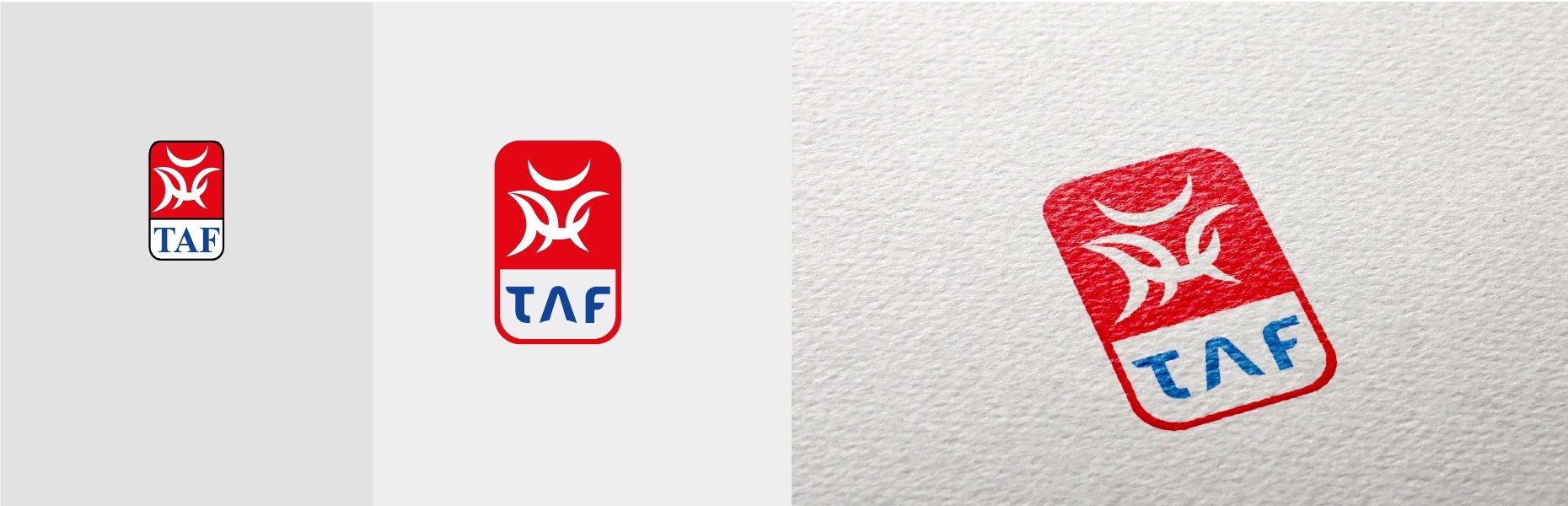
TAF, a manufacturer of polymer enclosures and electrical supplies from Santa Catarina, had first-class products and factories, but its communication did not match that scale. Competing with global brands, it needed to look as strong as what it delivers.

The symbol was born from a drawing by the founder and carries decades of recognition. That's why BDDB.ag kept the symbol and changed only the typography, which became more modern, geometric and legible, and created the signature Siga esta energia (follow this energy). From there, the new brand went onto packaging, catalogs, fleet, factories, a 25th anniversary seal and even a mascot.

TAF brand before and after the redesign
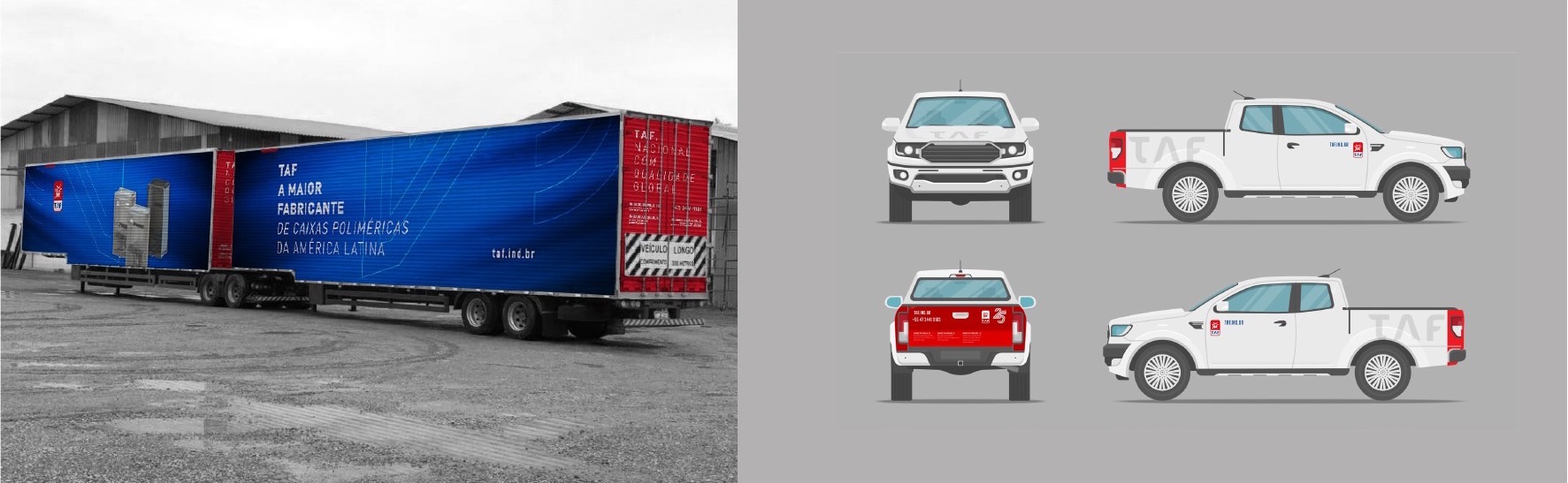
B-train truck and pickups with the new TAF identity

01Fleet

The brand on the road

B-train truck and pickups with the new identity. Wherever it goes, the fleet presents TAF as the largest manufacturer of polymer enclosures in Latin America.

TAF circuit breaker line packaging

02Packaging

Packaging that stands out on the shelf

Boxes and labels for the circuit breaker line with the new identity and clear technical information for retailers and electricians.

TAF regional product catalogs

03Catalogs

A catalog for each region of the country

Each region got its own color and a catalog with the right product mix. Sales reps bring customers exactly what sells there.

REBRANDING · ATACADO GAMES → ATACADO CONNECT

When the name becomes too small for the company, it's time to reposition

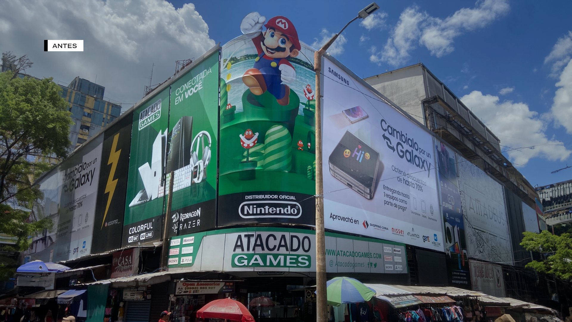
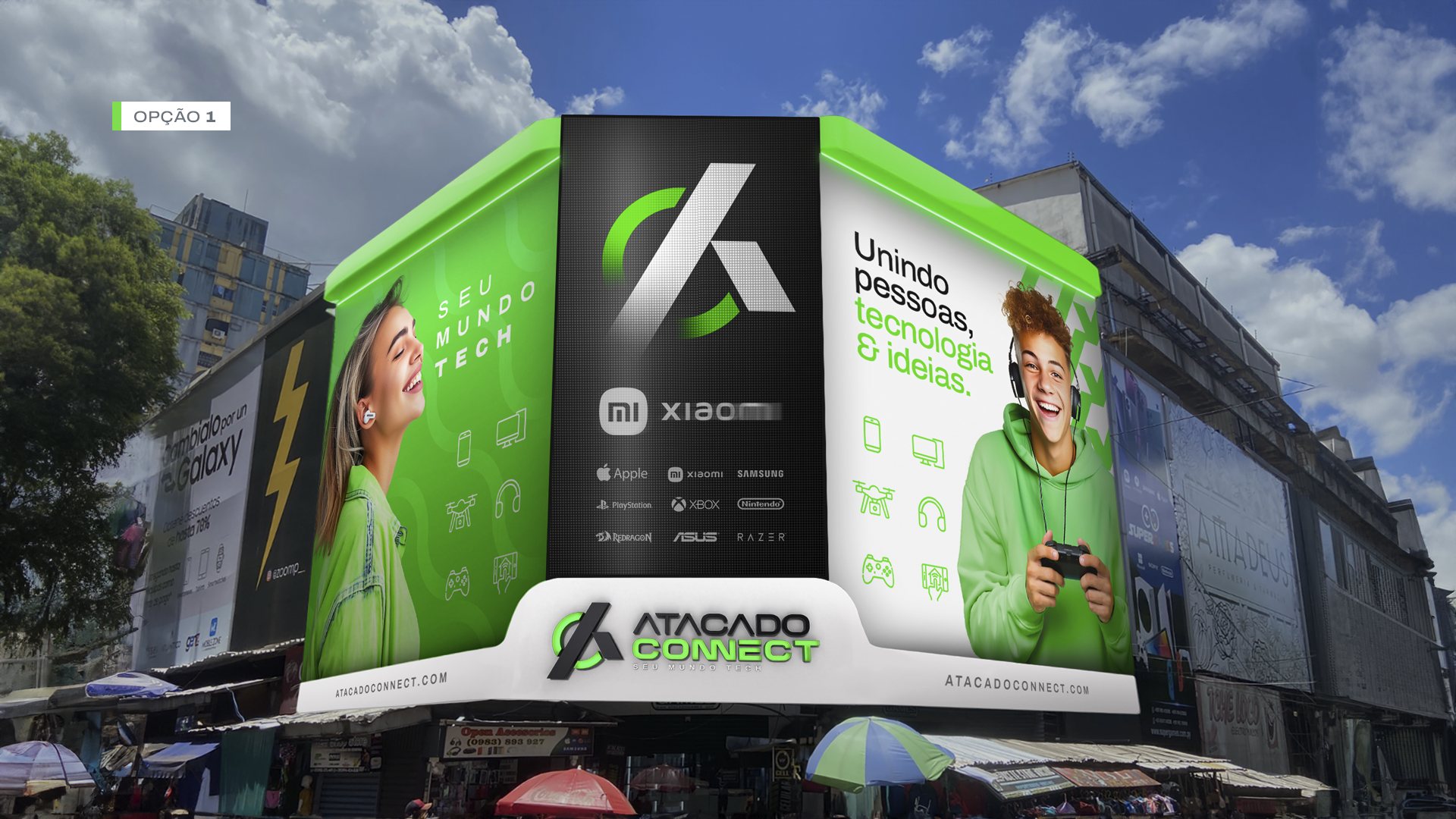
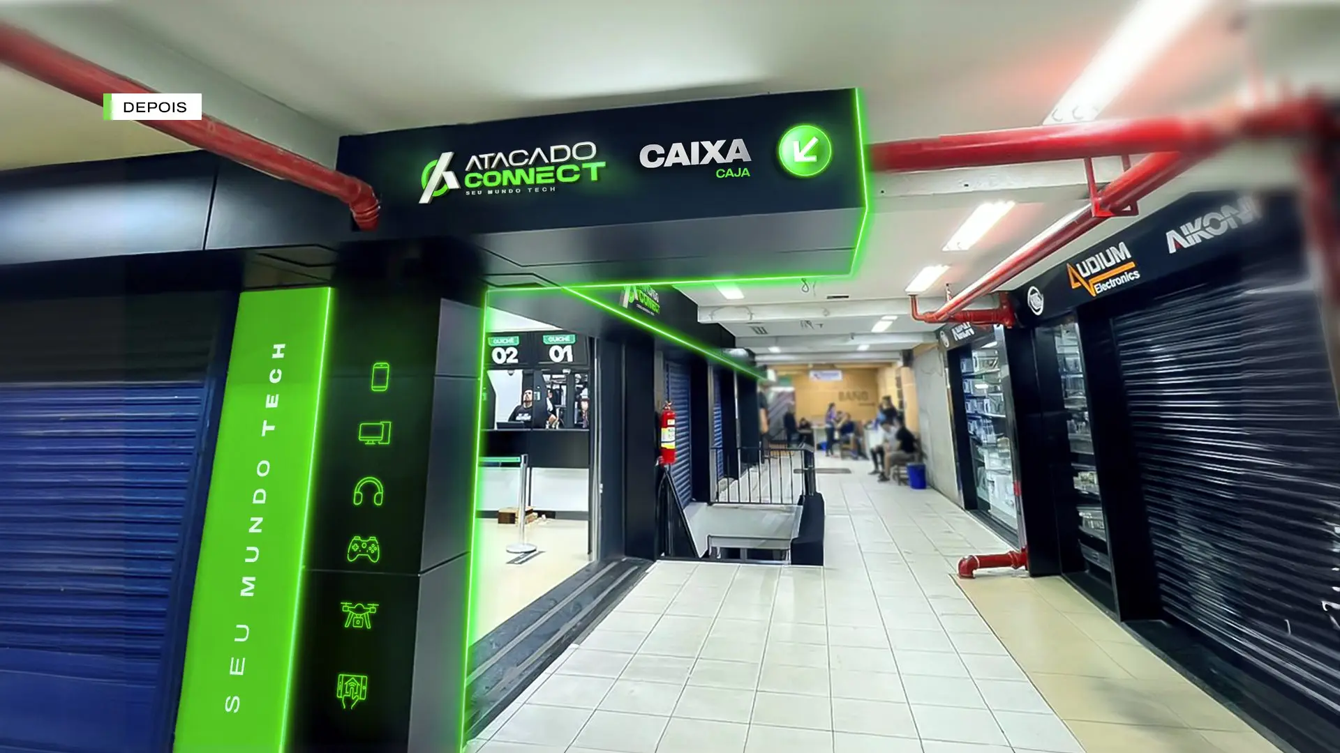
Atacado Games started as a 2 m² video game store and became one of the largest technology companies in Paraguay. The research led by BDDB.ag showed that the name no longer represented the business. The result was a complete rebranding: new name, brand platform, identity, stores and e-commerce.

See the full case on the Branding page →

Before: building with the Atacado Games signAfter: building with the Atacado Connect sign
Before · Atacado GamesAfter · Atacado Connect

Drag to compare before and after

Before: storefrontAfter: storefront
BeforeAfter
Storefront
Before: product displayAfter: product display
BeforeAfter
Product display
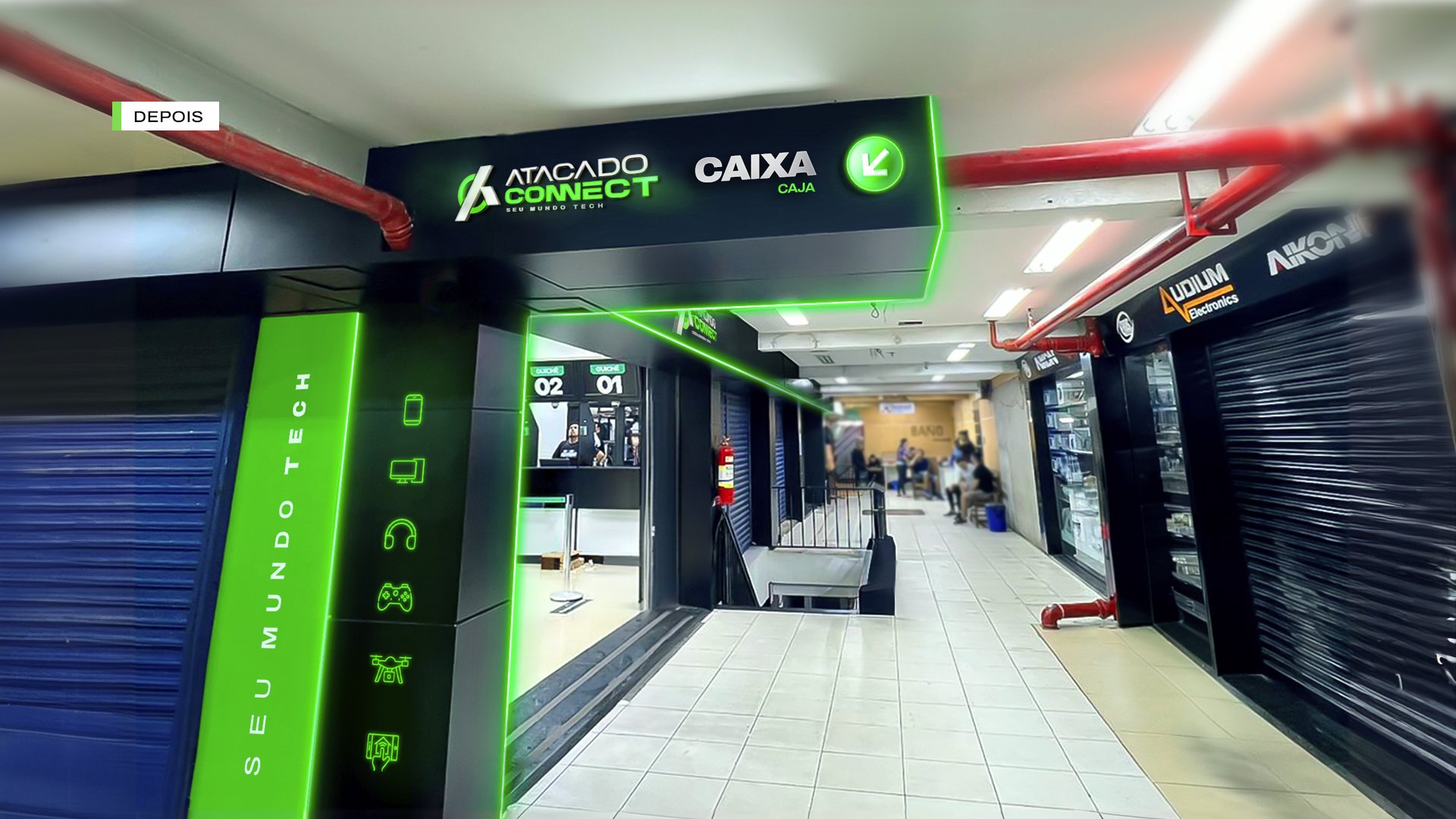
Before: entrance and circulationAfter: entrance and circulation
BeforeAfter
Entrance and circulation

REBRANDINGS WE HAVE LED

Brands renewed for a new business chapter

Healthcare, logistics, technology and engineering. In every case, the rebranding started with a diagnosis and ended with the new brand rolled out and presented to the people who matter.

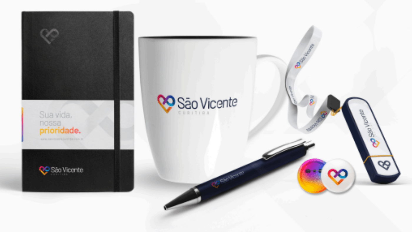
Hospital São Vicente · Curitiba

A new brand to celebrate 80 years

Internal and national research, a new brand with a heart and the infinity symbol, brandbook and the launch for staff and medical team.

ResearchNew brandBrandbookLaunch event
The new brand
Launch event

Translog · São Gabriel Transportes

A new brand for a 20-year-old transportation company

The rebranding accompanied the company's 20th anniversary celebration, renewing the brand without losing the trust built with clients.

RebrandingBrand anniversaryFilm
New brand
20th anniversary film

Magazord

A brand that lives up to the platform

A new brand for the Magazord e-commerce platform, ready to grow in digital.

RebrandingTechnologyMotion
Presentation of the new brand

Select Engenharia

Engineering with a new identity

Rebranding for an engineering company that needed a more solid, current brand to compete for new contracts.

RebrandingB2BMotion
Presentation of the new brand
Brandobook Hospital São Vicente: BDDB.ag.ag

HOSPITAL SÃO VICENTE CASE

A new brand for an institution that cares for Curitiba

BDDB.ag developed the new brand for Hospital São Vicente Curitiba and the brandbook that guides its use. The identity modernizes the institution while keeping the warmth patients and doctors already recognized.

BRAND RELIFT

Evolving without erasing history

In the relift for IGR Grasel Advogados, BDDB.ag updated the symbol, stationery and digital presence while keeping the strength of the original brand. The change is perceived as evolution, not as a break.

Igr grasel relift de marca e papelaria pagina

CLIENTS

Brands that trust BDDB.ag

  • Brand served by BDDB.ag
  • Brand served by BDDB.ag
  • Brand served by BDDB.ag
  • Brand served by BDDB.ag
  • Brand served by BDDB.ag
  • Brand served by BDDB.ag
  • Brand served by BDDB.ag
  • Brand served by BDDB.ag
  • Brand served by BDDB.ag
  • Brand served by BDDB.ag
  • Brand served by BDDB.ag
  • Brand served by BDDB.ag
  • Brand served by BDDB.ag
  • Brand served by BDDB.ag
  • Brand served by BDDB.ag
  • Brand served by BDDB.ag
  • Brand served by BDDB.ag
  • Brand served by BDDB.ag
  • Brand served by BDDB.ag
  • Brand served by BDDB.ag
  • Brand served by BDDB.ag
  • Brand served by BDDB.ag
  • Brand served by BDDB.ag
  • Brand served by BDDB.ag

Frequently asked questions

Questions about rebranding

What is rebranding?

It is the process of reviewing an existing brand, which may involve positioning, name, visual identity and communication, to align it with where the company stands today.

When should a company rebrand?

When the brand no longer represents the business: after growth, a change in audience, a merger, entry into new markets, or when the audience's perception falls short of the company's real quality.

Is rebranding just changing the logo?

No. Changing the logo without reviewing the strategy usually produces only an aesthetic change. Rebranding starts with positioning and then reaches the visual identity.

Will I lose customers by changing the brand?

The risk drops with a diagnosis and a transition plan. We keep the elements the audience recognizes when it makes sense, and we communicate the change in advance to staff and customers.

What is the difference between rebranding and brand repositioning?

Repositioning changes the strategy, that is, how the brand wants to be perceived and by whom. Rebranding is the broader term and can include repositioning as well as a change of name and identity.

Talk to BDDB.ag

Tell us where your brand stands

A BDDB.ag partner replies within 1 business day, with a clear path forward, not a generic proposal.

Rather talk now? WhatsApp (11) 99556-7878

Loading the form…

Instagram

@bddb.ag